
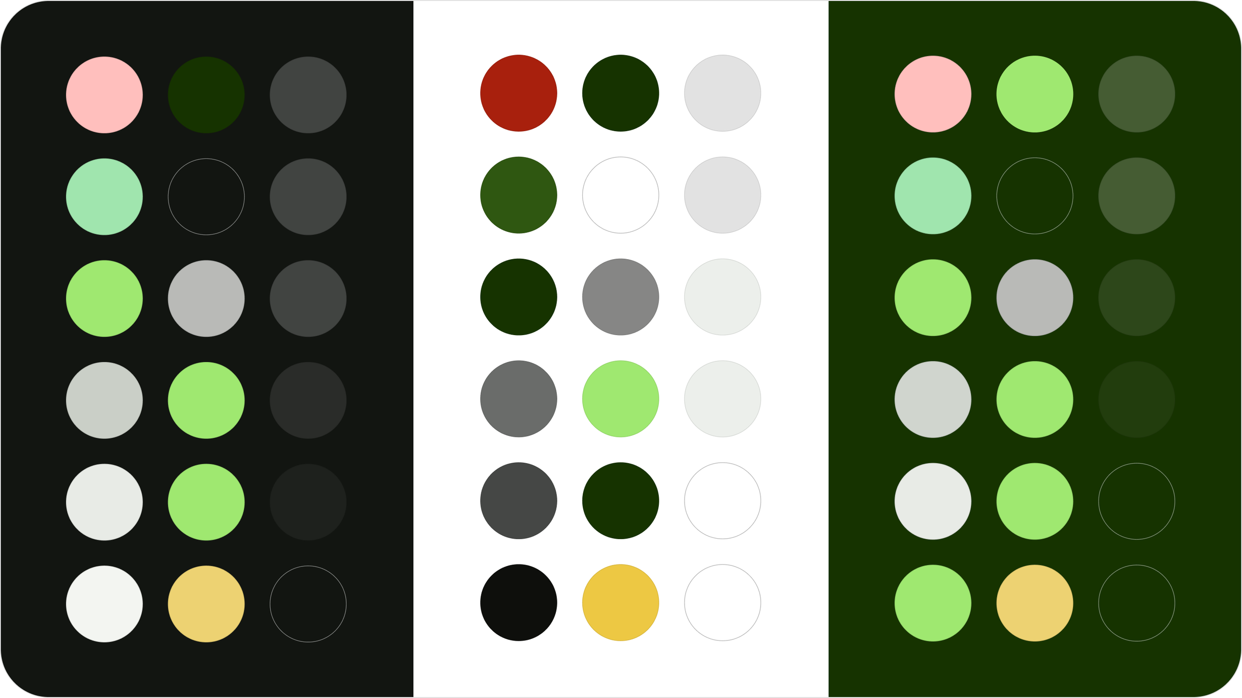
Wise colour tokens
📈 Increasing adoption, brand awareness, & accessibility for an award-winning rebrand.
Wise (formerly TransferWise) is an international account used by over 16 million people. As part of the team behind the Wise rebrand, I designed a new foundational colour token library to use everywhere in product. The rebrand increased brand awareness, achieving a 35% uplift in multi-product adoption, and colour pairings on all 3 themes complied with WCAG 2.2 and APCA contrast requirements.
Role: Lead designer
Team: 2 more designers & 7 developers
Creative direction: Ragged Edge
Wider collaboration: 4 more rebrand work-streams, design ops, leadership, brand, & 70+ product teams
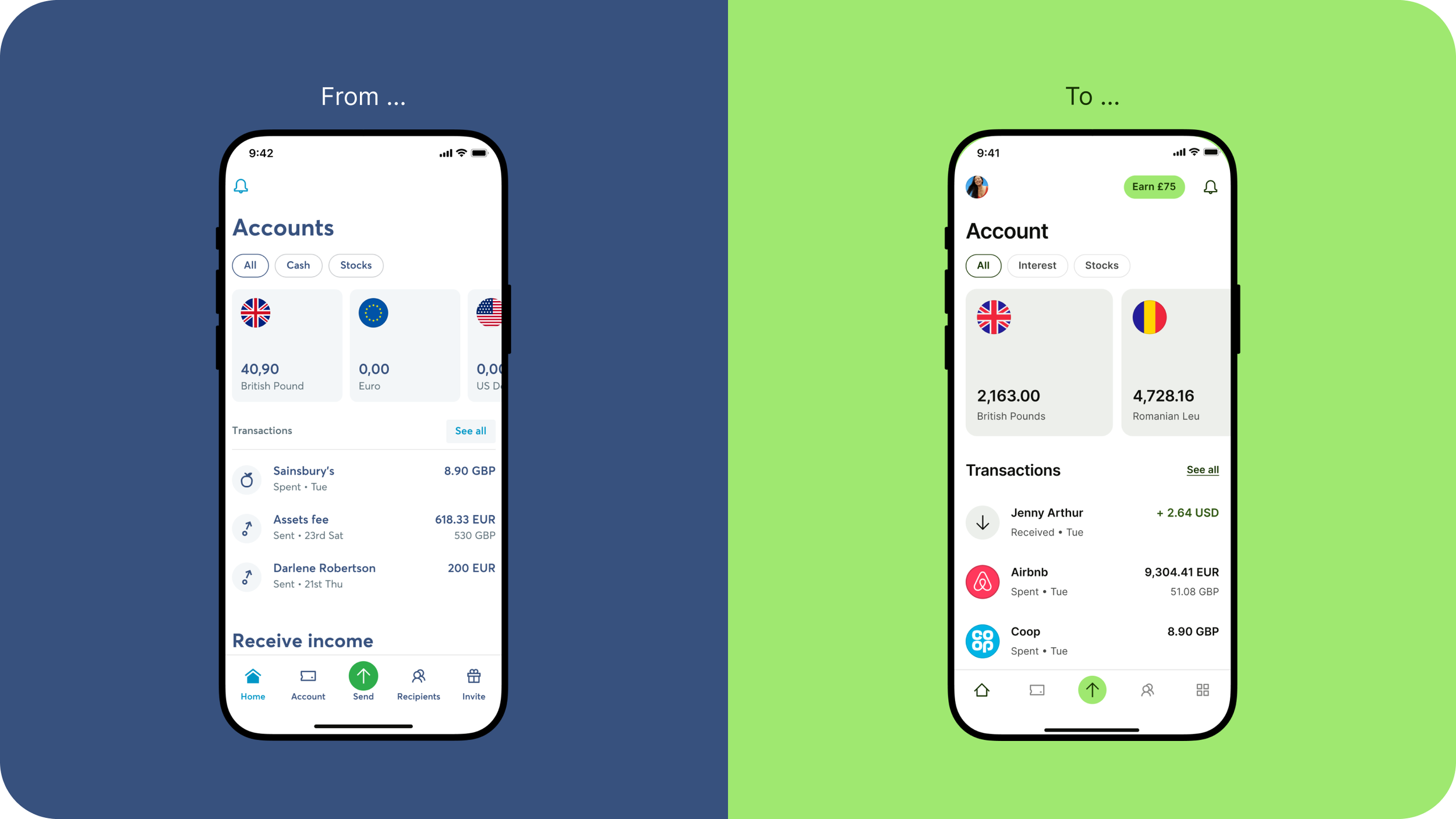
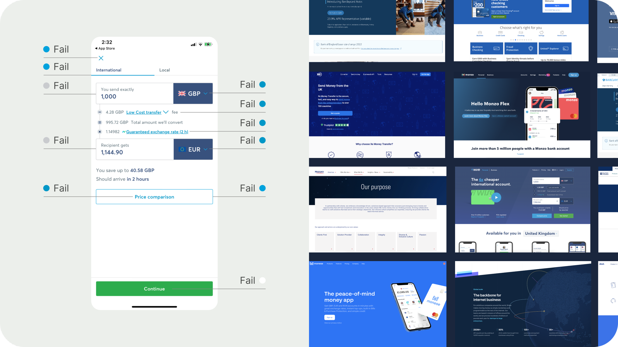
🤔 The existing colours lacked impact and contrast
The product looked dated and lacked visual impact.
Most Fintech brands were blue; Wise was lost in a sea of sameness.
Key colours failed accessible contrast tests.
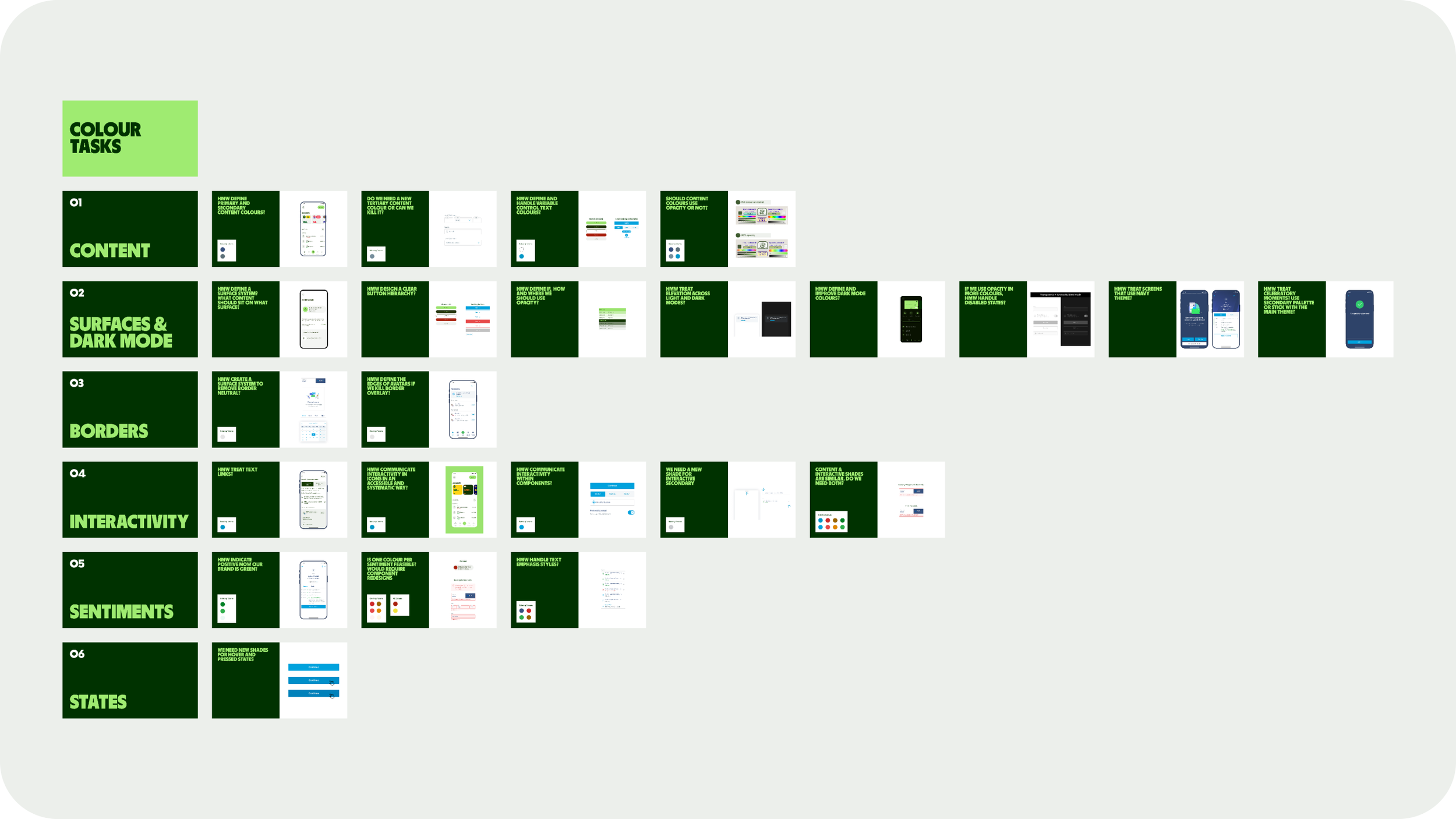
🔎 Auditing screens & concepts to create a roadmap
Ragged Edge set the visual direction and shared creative concepts. The challenge was to translate the vision to real product screens and create a scaleable colour system. I audited the concepts against existing libraries and screens to scope the work and create a delivery plan for the team.
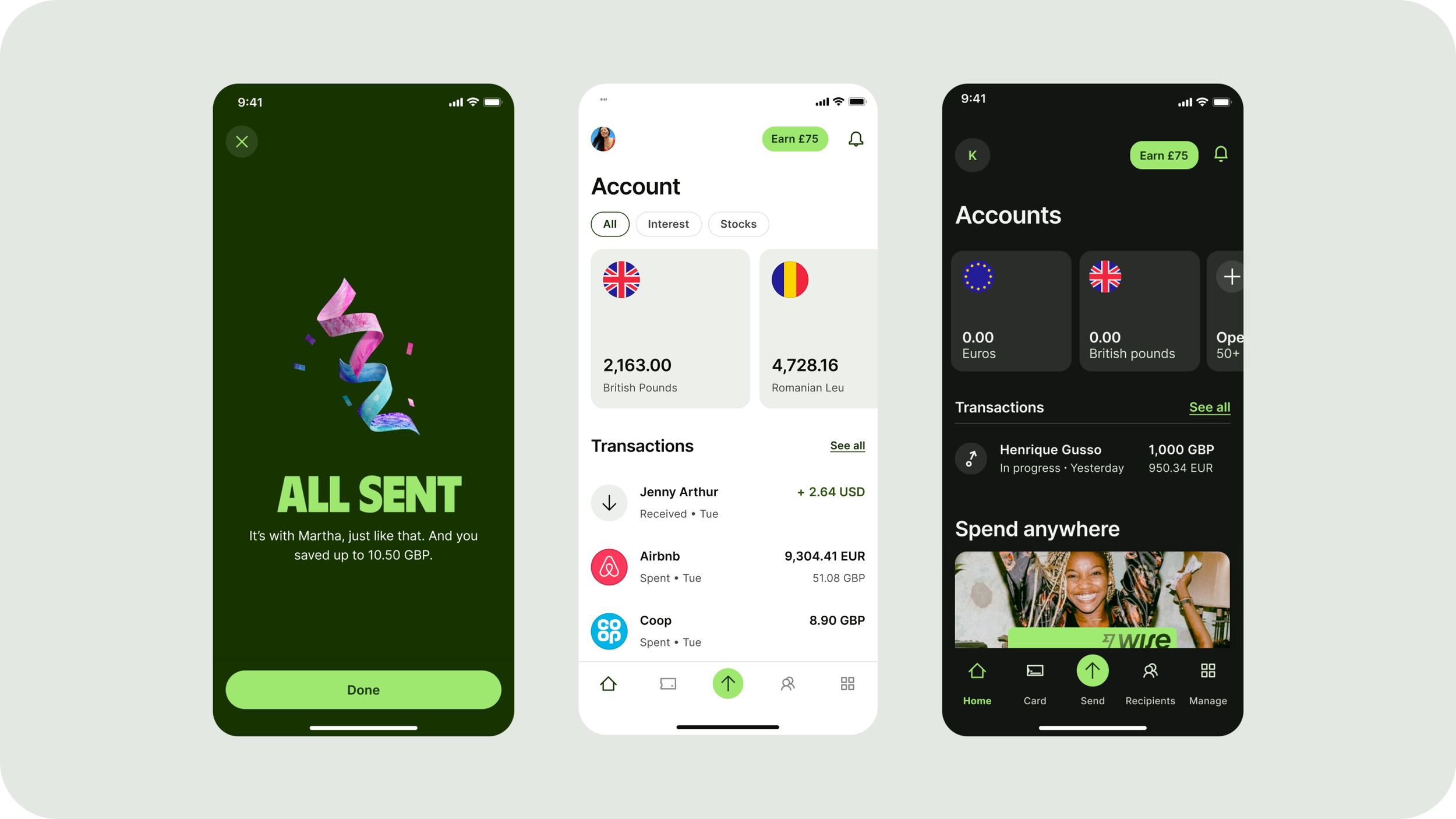
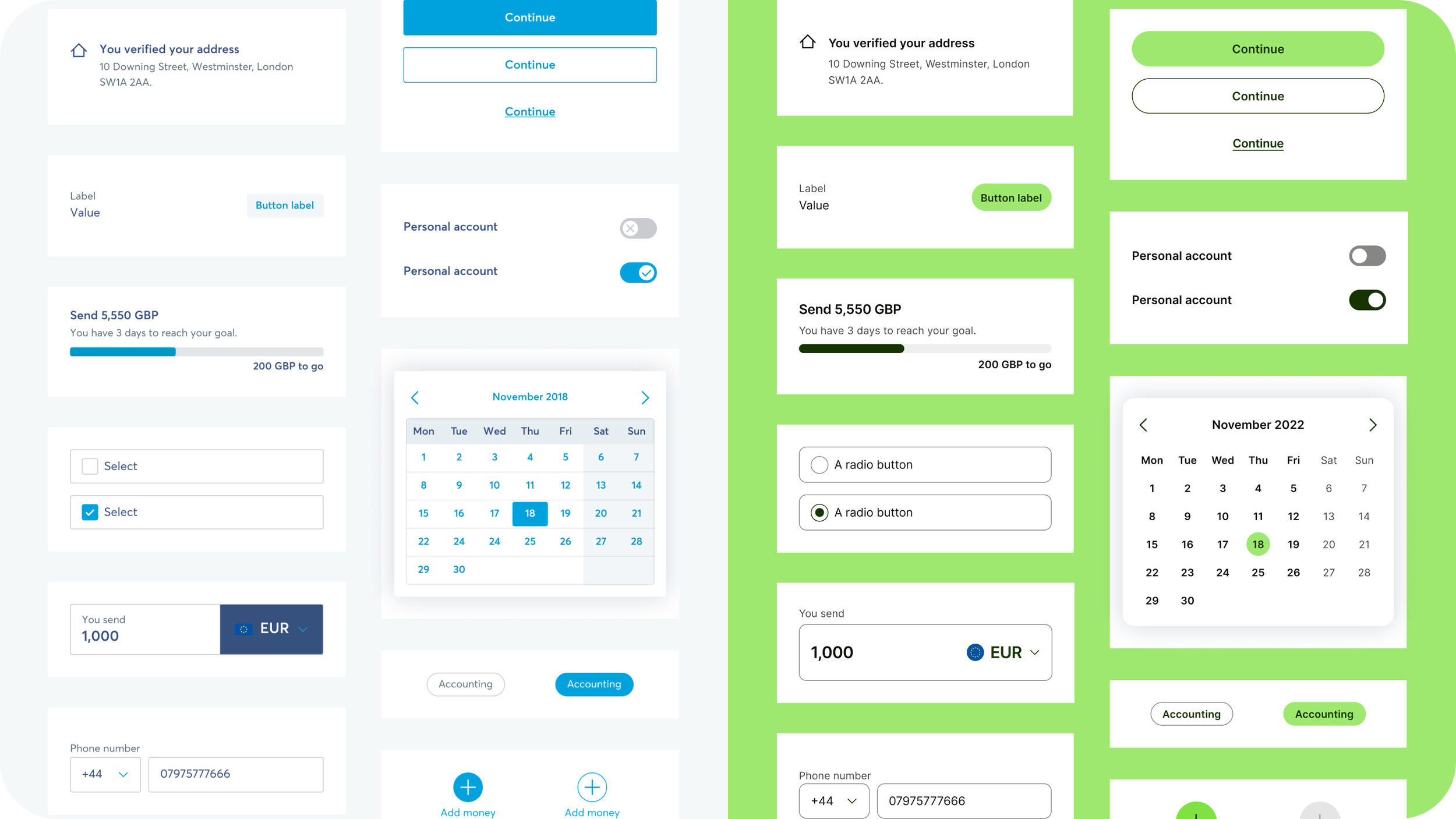
🎨 Balancing hierarchy, accessibility, and brand distinctiveness
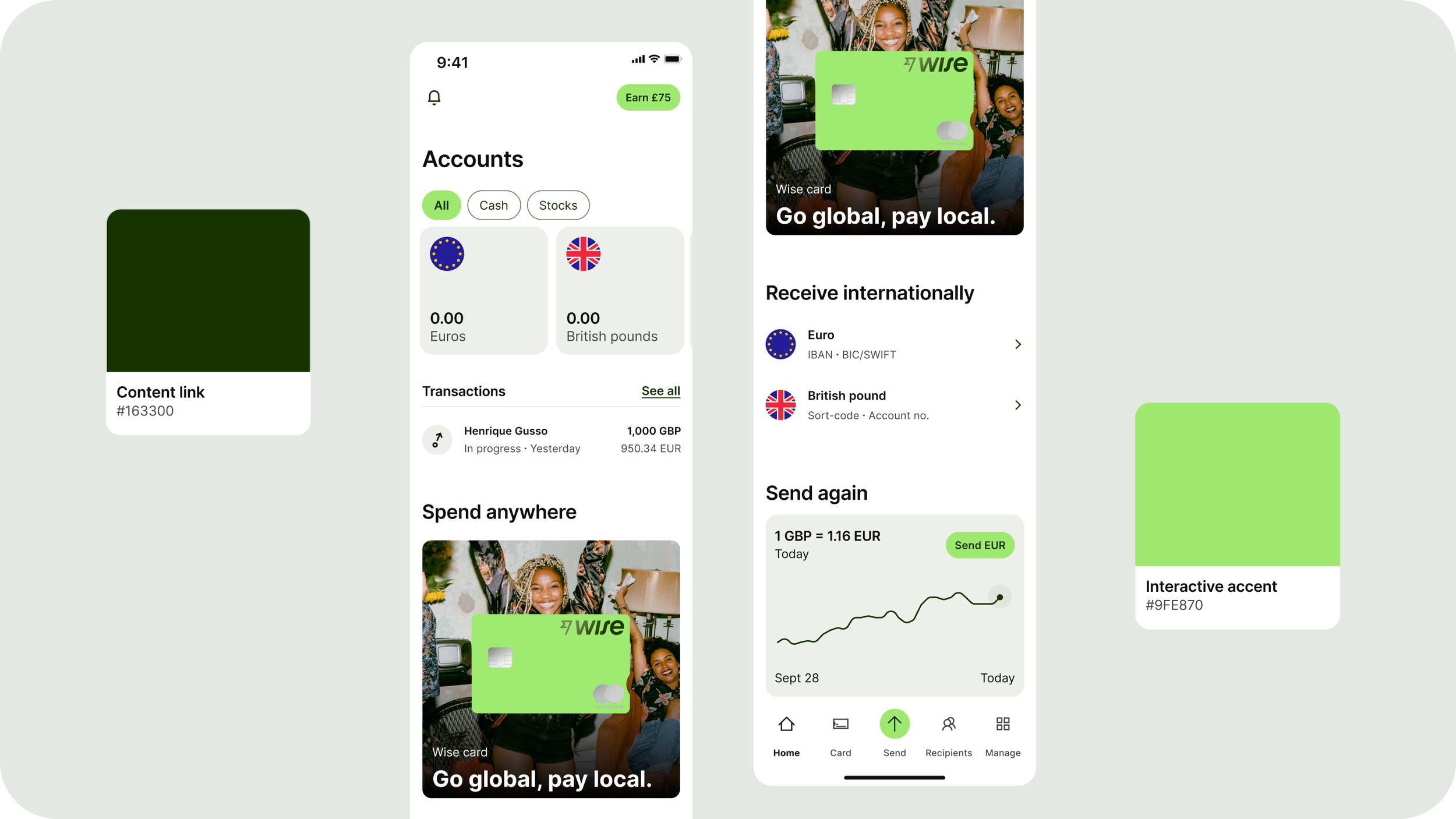
First, we defined text colours that made bright green buttons pop. Neutrals with a hint of green provided a clearer hierarchy than overly green colours. After that, we defined colours for surfaces, borders, interactivity, theming, and more. We then stress-tested colours in our component library, top trafficked screens, and code.
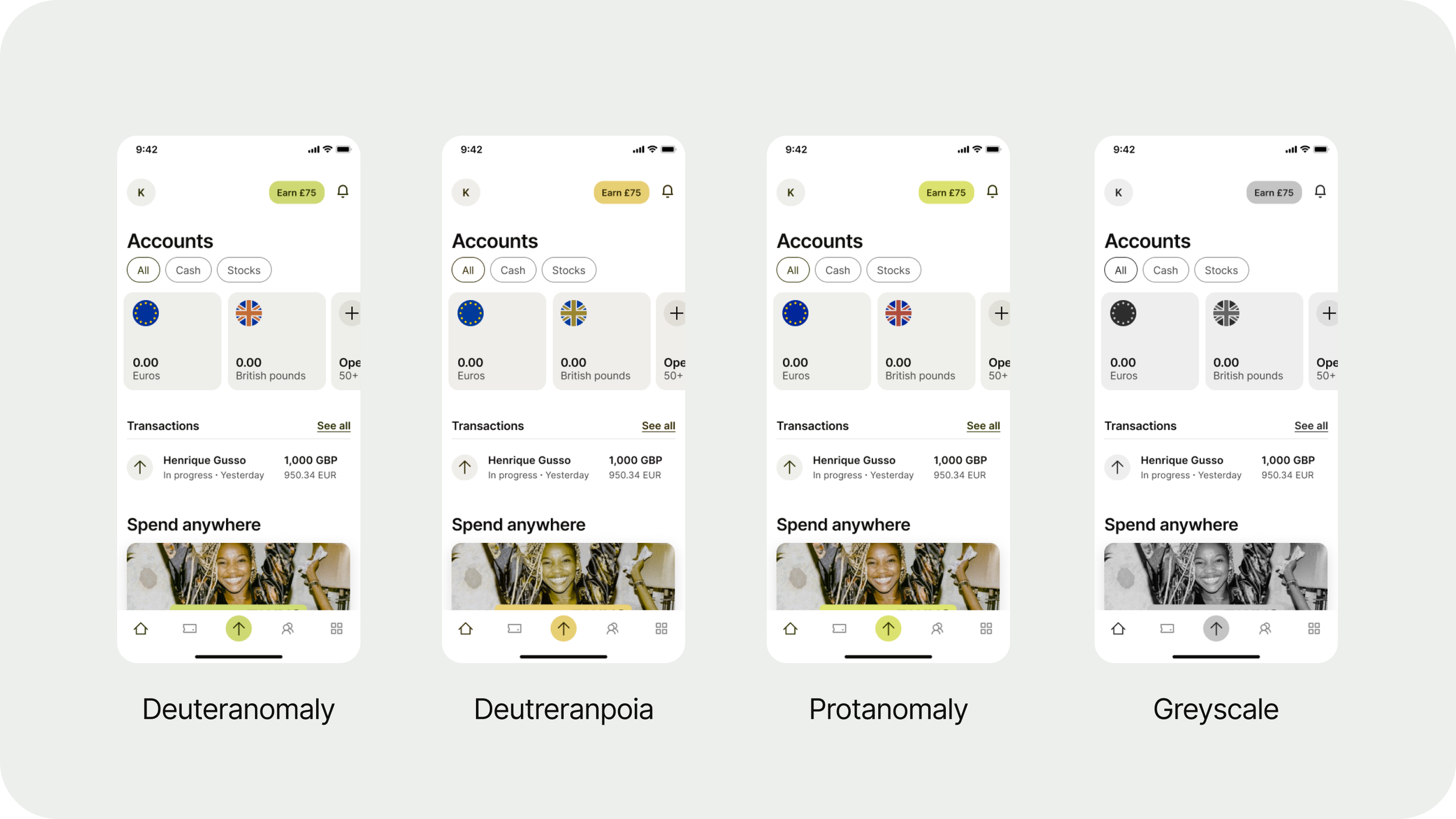
👁️ Advanced contrast tests and colourblindness simulations
Our strategy was to test, iterate, repeat until every colour pairing on every theme excelled WCAG and APCA requirements. We significantly increased contrast scores, and ran colourblindness simulations too. To find out more, read my full case study on colour accessibility.
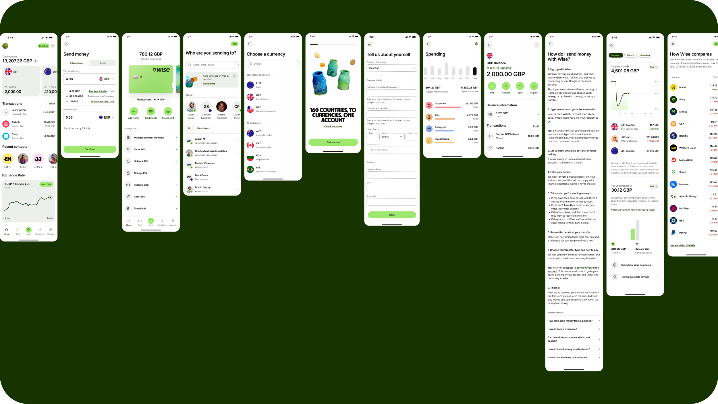
🛠️ Supporting the build and rolling out to teams
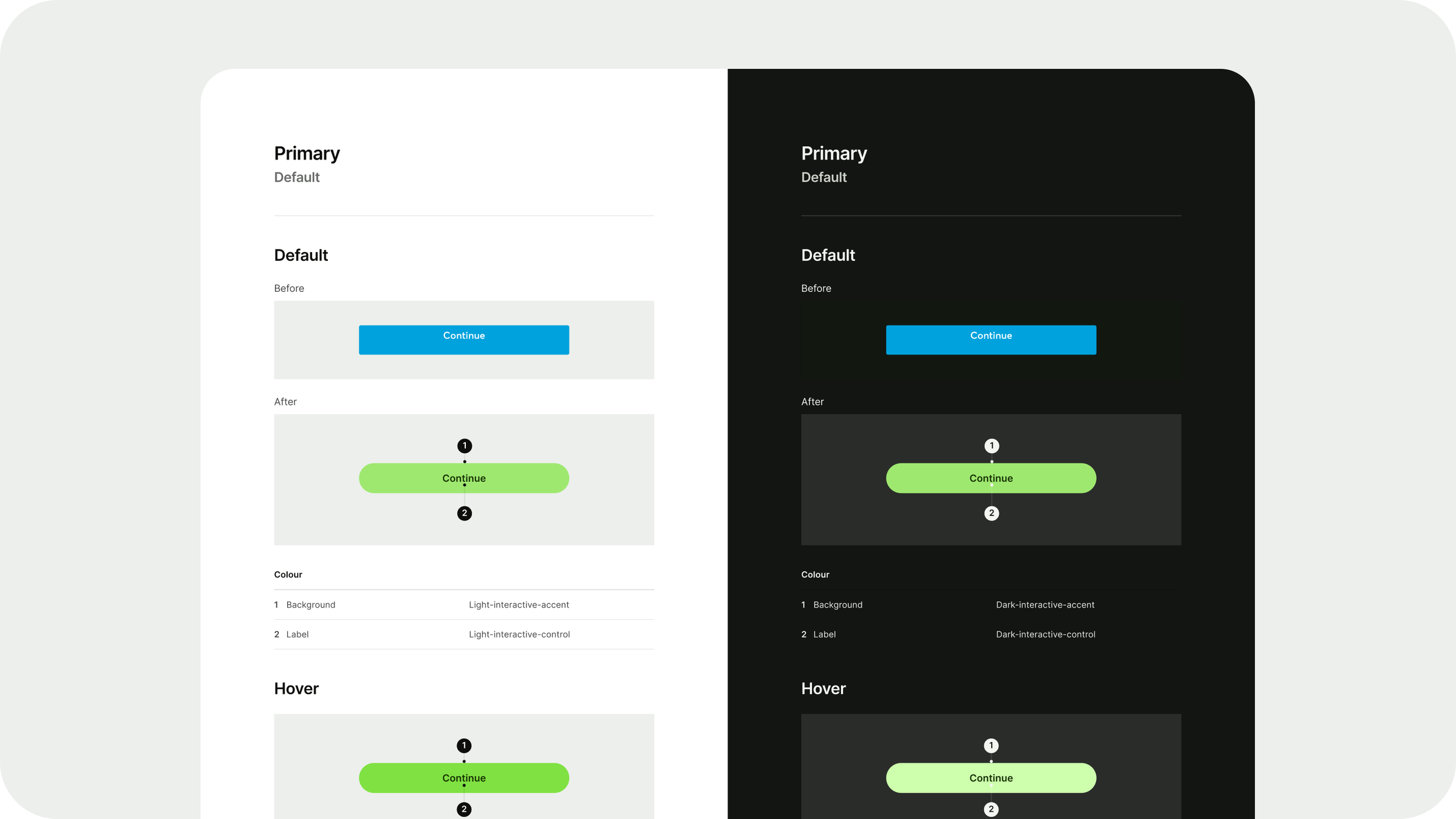
Working with our engineers to support the implementation, I created detailed documentation mapping old vs new tokens, and a component library spec showing how colours tokens were applied to components across all themes. I also implemented the new tokens as variable modes in Figma, and led the colour QA on Android, iOS, & web, as well as supporting product teams across the wider organisation.
📊 The results:
Increased brand awareness resulting in a 35% increase in multi-product adoption
Achieved a QX score of 83.07%, with scores for appearance, trust, loyalty, and usability all increasing
Launched a 100% accessible palette across 3 colour themes
The design system was globally adopted across all Wise platforms and experiences
My case study got over 1 million hits and was shared by Smashing Magazine founder Vitaly Freidman
🏆 Awards
Best Adoption — Zeroheight Design System Awards
Best Project — Armin Vit, Brand New
Highly commended for best app design, best rebrand, and best in-house team — Design Week
Shortlisted for Branding Design Systems category — D&AD