
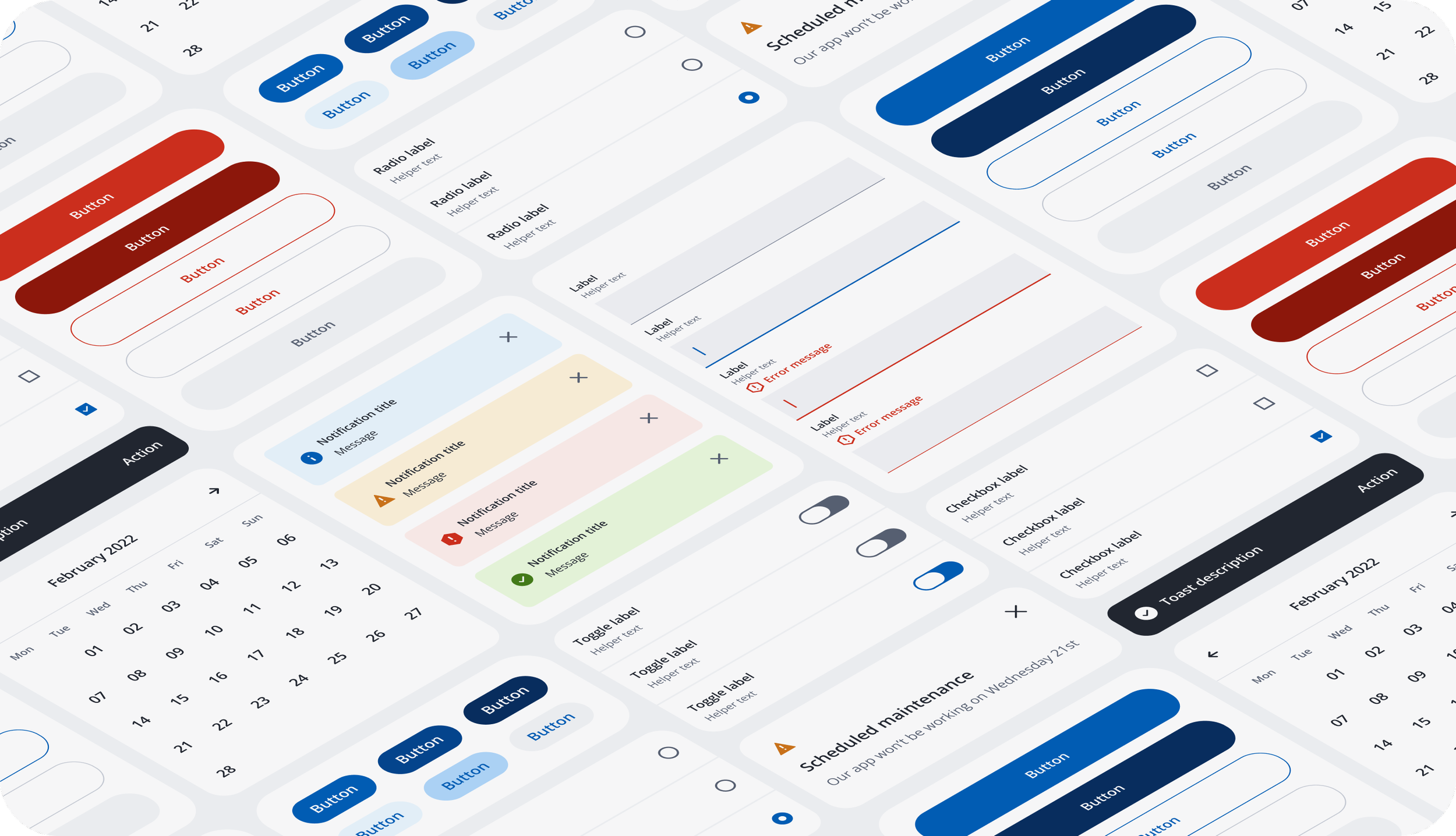
JPMC components
💙 Making a JPMorganChase design system 100% accessible
I led a component library accessibility uplift, enhancing 49 design system components for a confidential 0-1 project within JPMorganChase.* The result was a fully accessible component library that was inclusive to all users and complied with the firm’s rigorous legal and quality standards. I also introduced processes and an annotation kit to build accessibility into the design phase.
*As it's confidential, I’m not allowed to share product specifics, so I will share generic examples only.
Role: Lead designer & project owner
Team: 1 more design systems designer, 6x engineers, 1x PM
Wider collaboration: In-house team of accessibility specialists & wider product teams.
🤔 All 49 components had to pass WCAG 2.2 AA
The component library was early stage and needed a full a11y audit
The design system lacked a11y documentation & guidance
The team needed a strategy for building a11y into their workflow
🔎 Auditing components & designing fixes to a11y issues
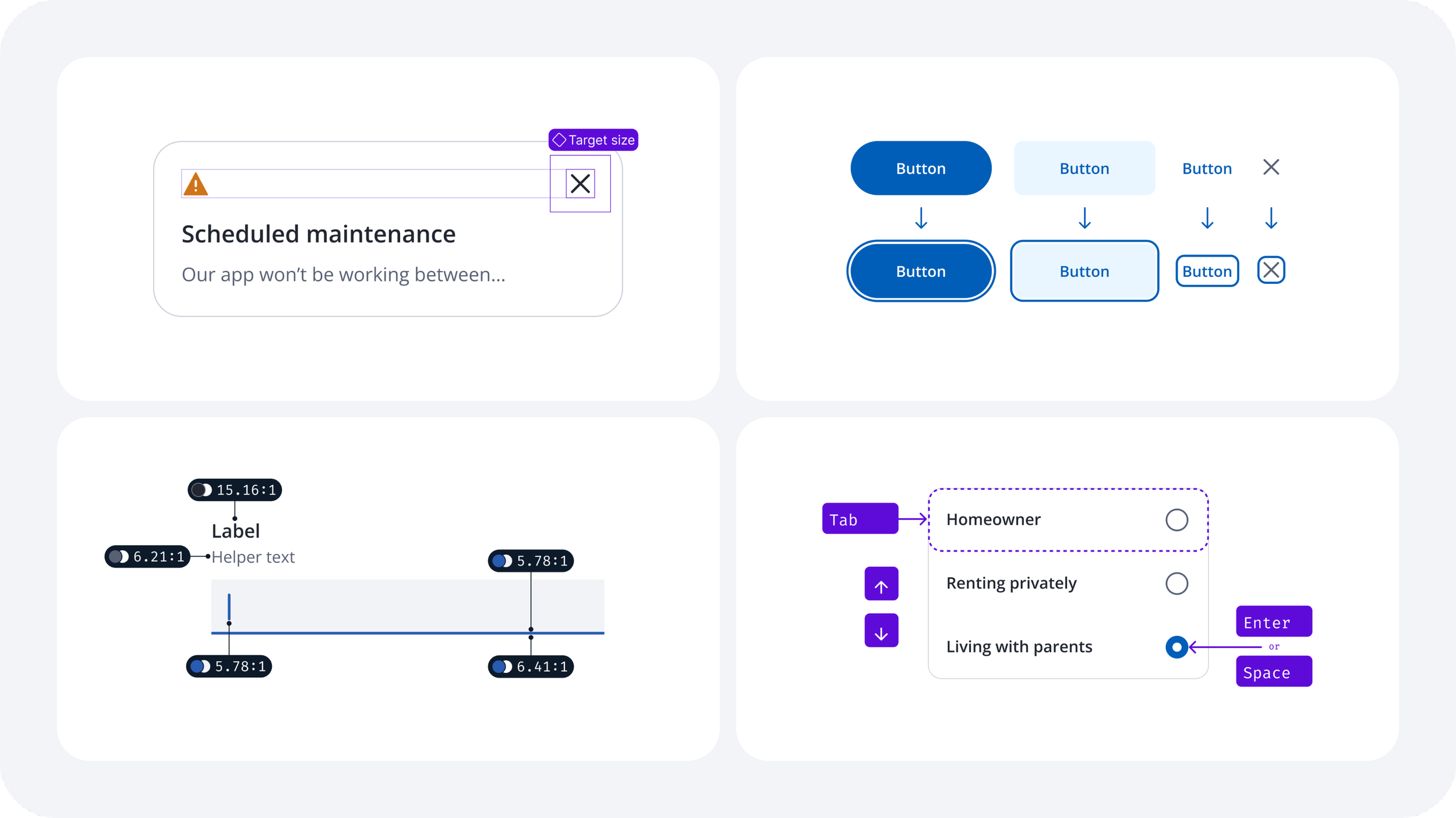
I prioritised components by frequency of use and audited them for a11y issues. I identified over 75 issues to fix — things like missing focus states, small touch targets, and low colour contrast. I logged issues in JIRA, made fixes to our design system libraries in Figma and Tokens Studio, and collaborated with engineers to QA the build.
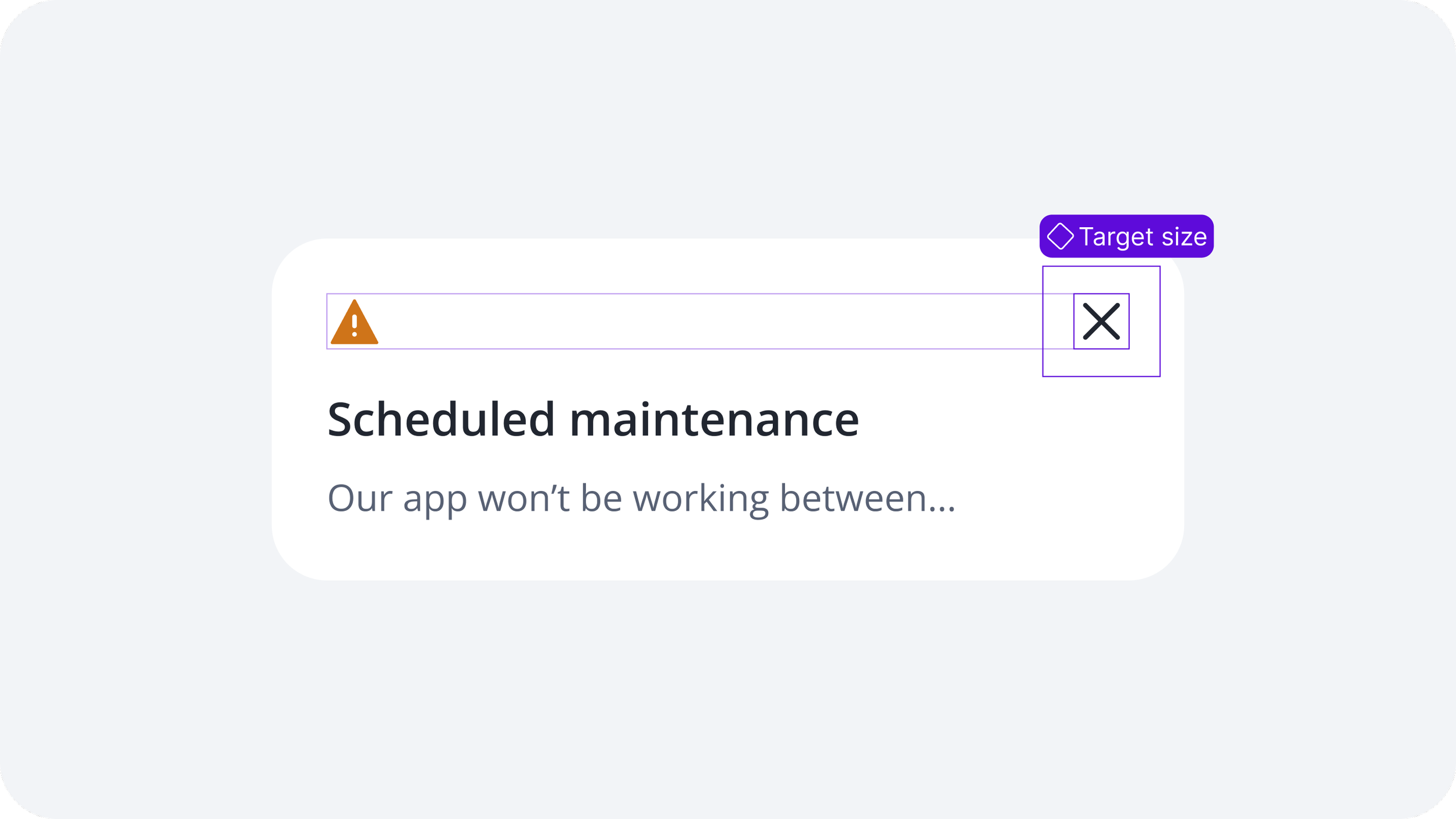
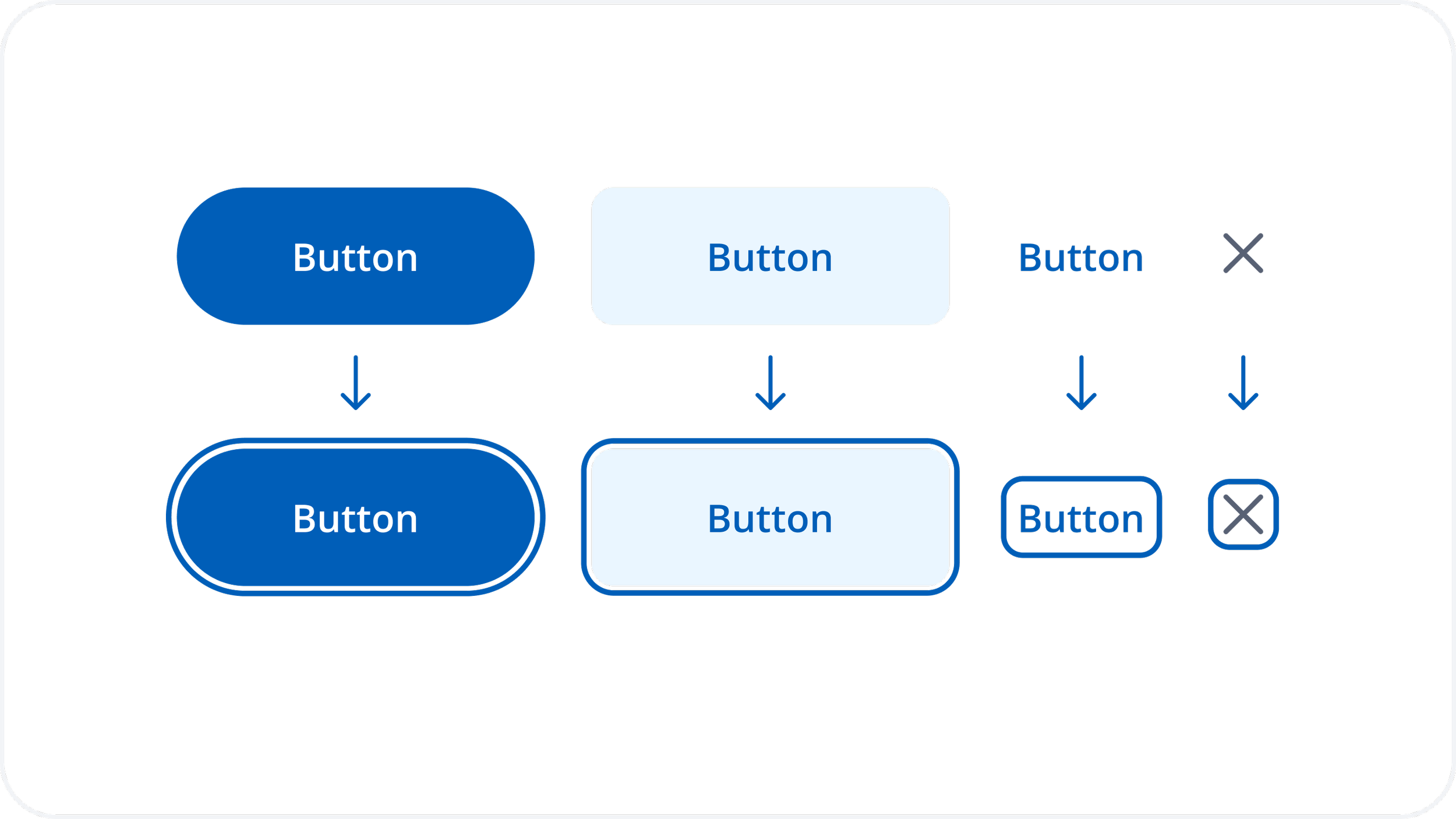
In this example, I extended the close button’s touch target to 48×48dp per Android guidelines by adding a target size container in Figma, guiding developers to apply the hitSlop prop without affecting Figma’s auto layout.
When designing focus states for keyboard navigation, I realised I would need to adjust the focus outline’s border radius to match the component’s shape, which involved creating new border radius tokens using Tokens Studio.
✏️ Documenting a11y decisions
We needed to present evidence to the wider business the design system was WCAG 2.2 compliant. So for each component, I created a detailed documentation page covering colour contrast, hierarchy, target size, keyboard navigation, 200% zoom, screen reader content and more. I also documented foundational guidance to share a11y tips & best practices with the team for future designs.
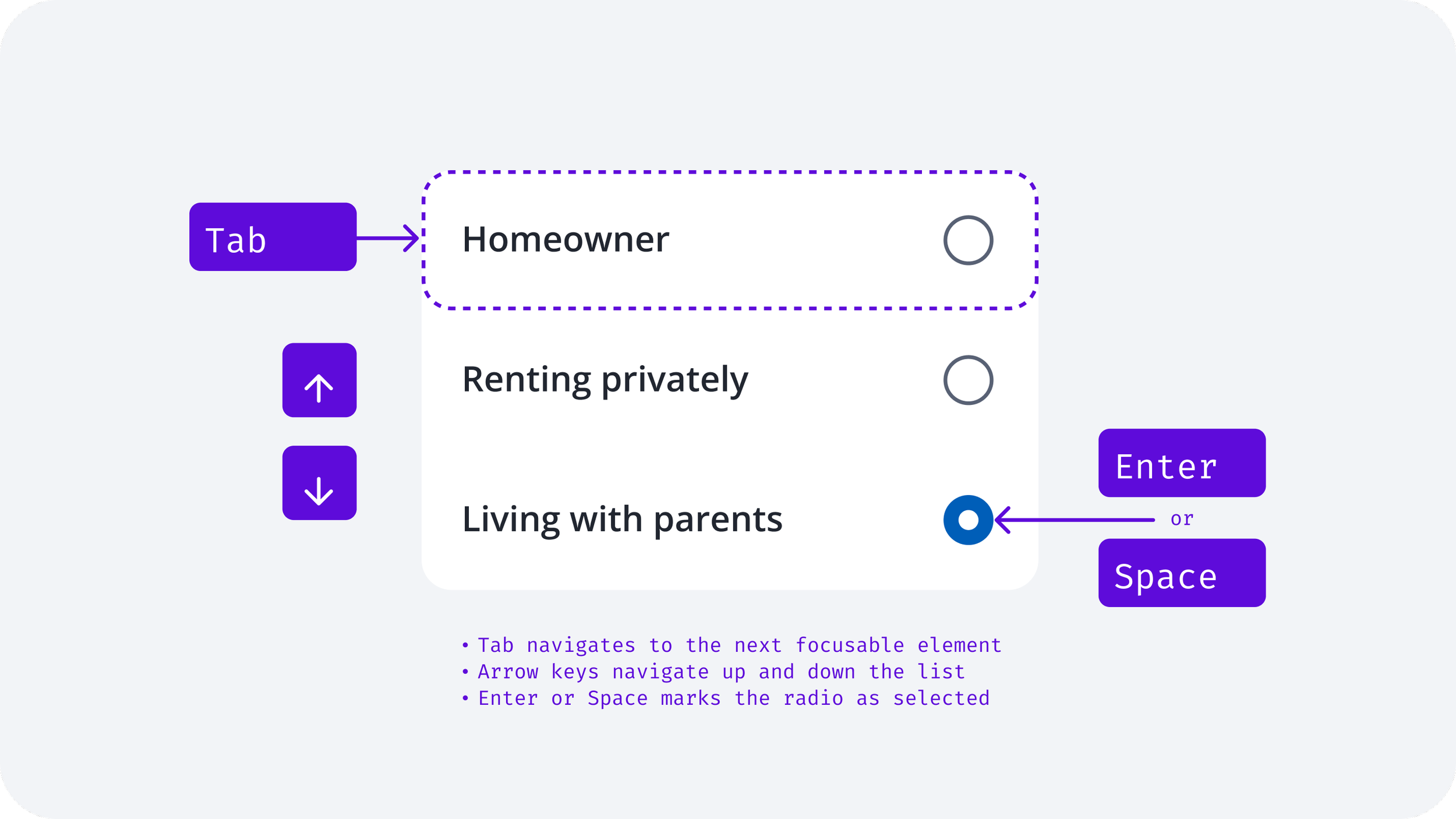
Example of how I documented keyboard navigation in components to make sure the experience is implemented correctly.
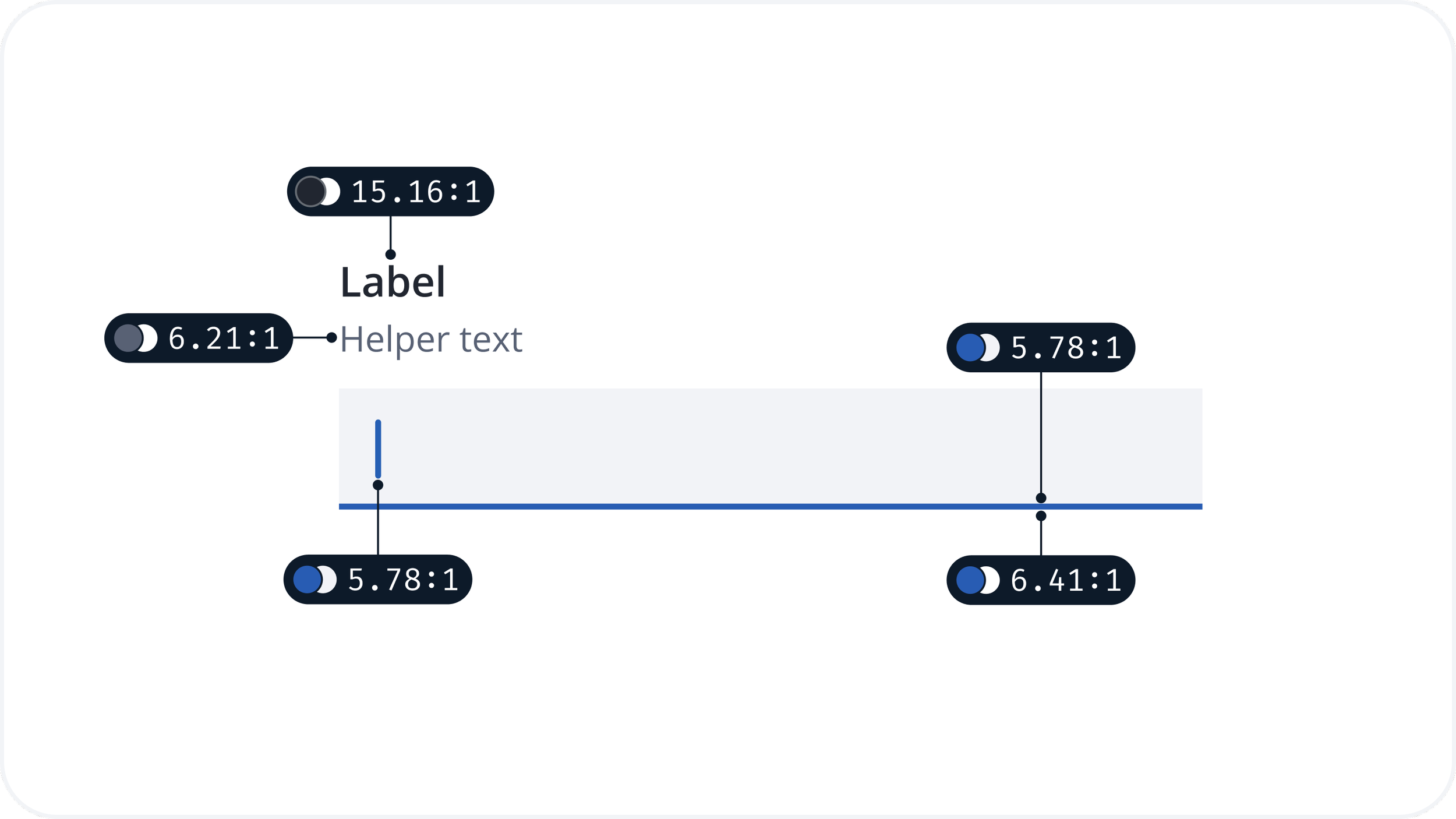
An example of a text input component with colour contrast annotations that I created to document accessible contrast ratios on light and dark modes.
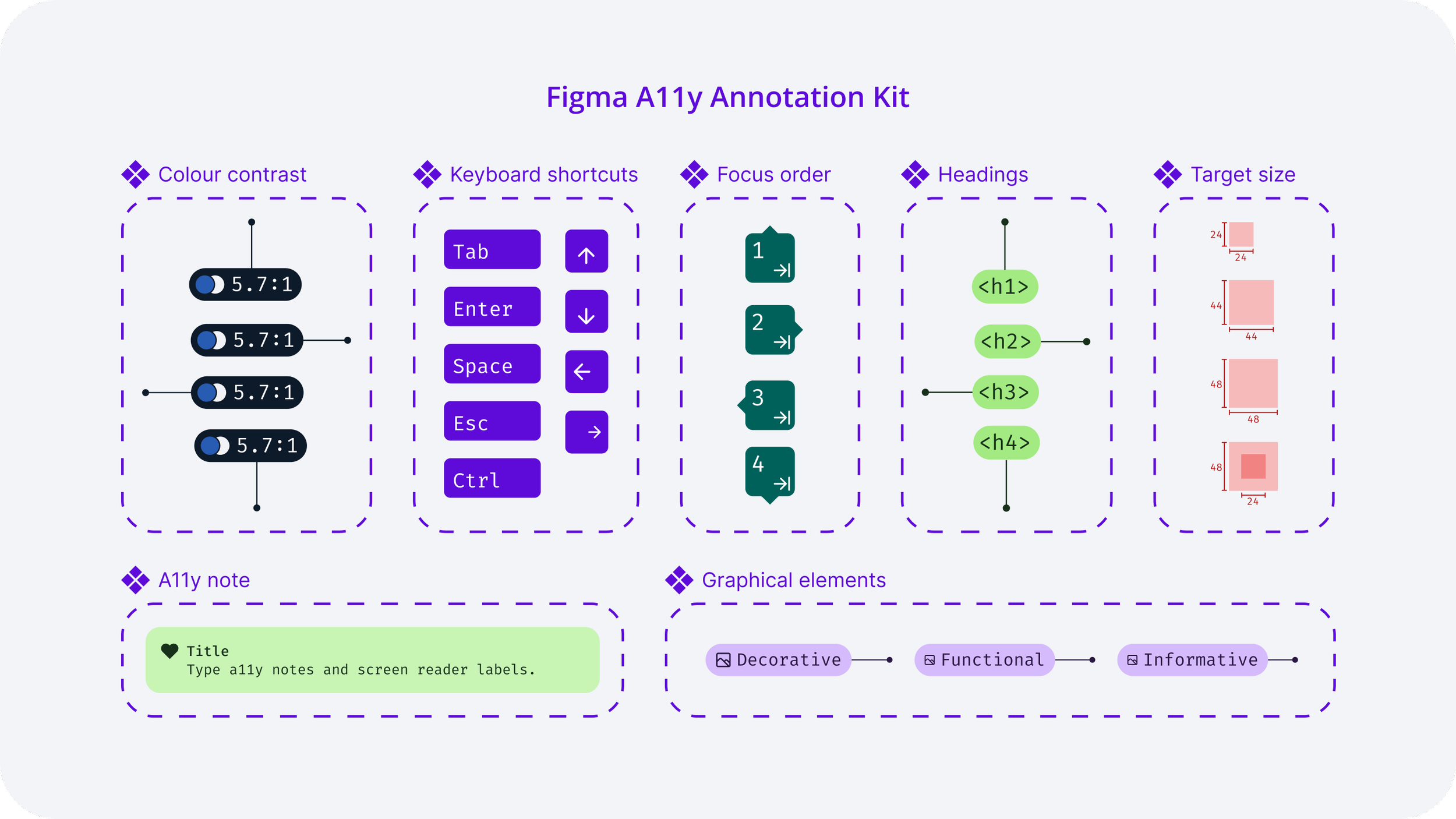
🤝 Establishing processes and creating an annotation kit
I noticed that accessibility was sometimes tackled reactively in the implementation phase, which caused issues and extra work for teams. I wanted to change that, so I started championing a shift-left approach — bringing accessibility into the design process from the start.
I learnt that the real efficiency comes from documenting as much as possible at a design system component level, freeing up designers to focus on contextual elements and screen level navigation. To make it easier, I created an annotation kit that helps teams record key decisions right in their Figma files, turning inclusive design into a shared everyday practice.

📢 Workshops to align stakeholders on consistent screen reader navigation
The biggest challenge was defining how to support assistive technologies for our tech stack. Components were using different ways to treat how content was grouped for screenreader focus, but we needed a consistent strategy to reduce cognitive load for users. So I brought engineering and in-house a11y specialists together through cross-functional workshops. As a result, we agreed to group content and add alt text into the main screenreader label, rather than reading it out line by line. This makes it easier for users as they can navigate the product in fewer swipes.
📊 The results:
A WCAG 2.2 AA compliant component library that provides an inclusive user experience and meets legal obligations
A detailed a11y guidance page per component, plus foundational guidance documented, spreading knowledge across teams
A shift-left process put in place, reducing implementation issues and increasing product quality